Dark theme guide
Dark Codex Theme: Calm Contrast, Not Pure Black
A good dark theme is not a black rectangle with white text. It has a surface, a hierarchy and one accent that tells you where to click.
Updated 2026-10-20
Quick answer
A dark Codex theme should use a near-black or slate surface rather than pure black, keep text at 4.5:1 or better, and reserve one accent for controls. Test disabled states, diffs and long tasks. If everything glows, the theme has no hierarchy.
#121316matte base surface
4.5:1text contrast target
1accent color

Dark theme guide
Pure black is a trap.
On an OLED display, pure black makes white text feel like it is vibrating. On an LCD, it removes the panel's sense of depth. A near-black surface with a slight warm or cool cast is easier to read and gives you room to separate panels.
Hierarchy matters more in dark mode because shadows do less work. Use surface lightness, borders and one accent. Do not use five shades of gray and three neon colors; that is not hierarchy, it is noise.
How it works
The decisions that actually change the result
- 01
Choose a cast
Warm slate feels editorial; cool slate feels technical. Pick one and keep it consistent.
- 02
Separate surfaces
Use a slightly lighter panel and a subtle border. Avoid relying on shadows in dark mode.
- 03
Reserve the accent
Use the accent for primary actions and focus. Do not paint headings, links and badges with it.
- 04
Verify the diff
Check added, removed and unchanged lines. Dark themes often lose the difference between red and green.
Prompt recipes
Prompt recipes for AI image models
These prompts are for creating a backdrop in your own account at WaveSpeed, SeeAPI, fal, Replicate or KIE. CodexSkin does not run them or charge for them.
Matte dark wallpaper
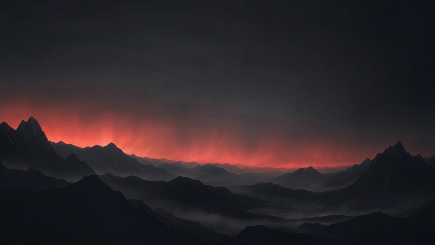
Abstract 16:9 dark desktop wallpaper, layered obsidian ridges, deep slate sky, one thin coral aurora, matte texture, large calm center, no text, no logos, no people, no watermark.Dark material study
Close-up abstract study of matte black stone and brushed graphite, one warm coral reflection at the edge, soft studio light, 16:9, minimal, no text, no logos.Image-to-image darkening
Keep the uploaded composition. Darken the surface to a warm near-black, reduce center detail, preserve edge texture, add one restrained coral highlight, return a 16:9 desktop backdrop, no text or logos.Which path fits
4 paths, one honest table
Pure blackHigh contrast but harsh; poor panel separation.
Warm slateComfortable for long reading and editorial work.
Cool slateTechnical and precise; watch blue-light fatigue.
High-saturation accentUse sparingly; it becomes tiring across a full session.
Next step
Make the dark theme quiet enough to use.
Open Obsidian Calm, test a dense diff and keep one accent for controls. If everything glows, remove something.
FAQ
Questions people actually ask
Is dark mode better for coding?
It depends on the room and the person. Dark mode reduces overall luminance but can increase halation for some readers. Choose a near-black surface, not pure black, and keep contrast comfortable rather than maximal.
What is the best dark Codex theme?
The best one keeps text readable, separates panels and preserves diff colors. Obsidian Calm is a quiet default; Violet Signal is more expressive. Test both with your actual work.
Why does white text vibrate on black?
The extreme luminance difference can cause halation, especially on OLED displays. A slightly lighter surface and slightly dimmer text reduce the effect.
Should I use pure black to save battery?
On OLED, pure black pixels are off and can save power. The readability trade-off is usually not worth it for a full workday. A near-black surface captures most of the benefit.
How do I keep diffs readable in dark mode?
Use diff colors with enough lightness and avoid relying on hue alone. Add a subtle background tint or a left border. Test a diff with additions, removals and context lines.
Can I use a dark theme during the day?
Yes, but match the room. A dark theme in bright daylight forces your eyes to work harder. Many people switch to a warm light theme during the day.